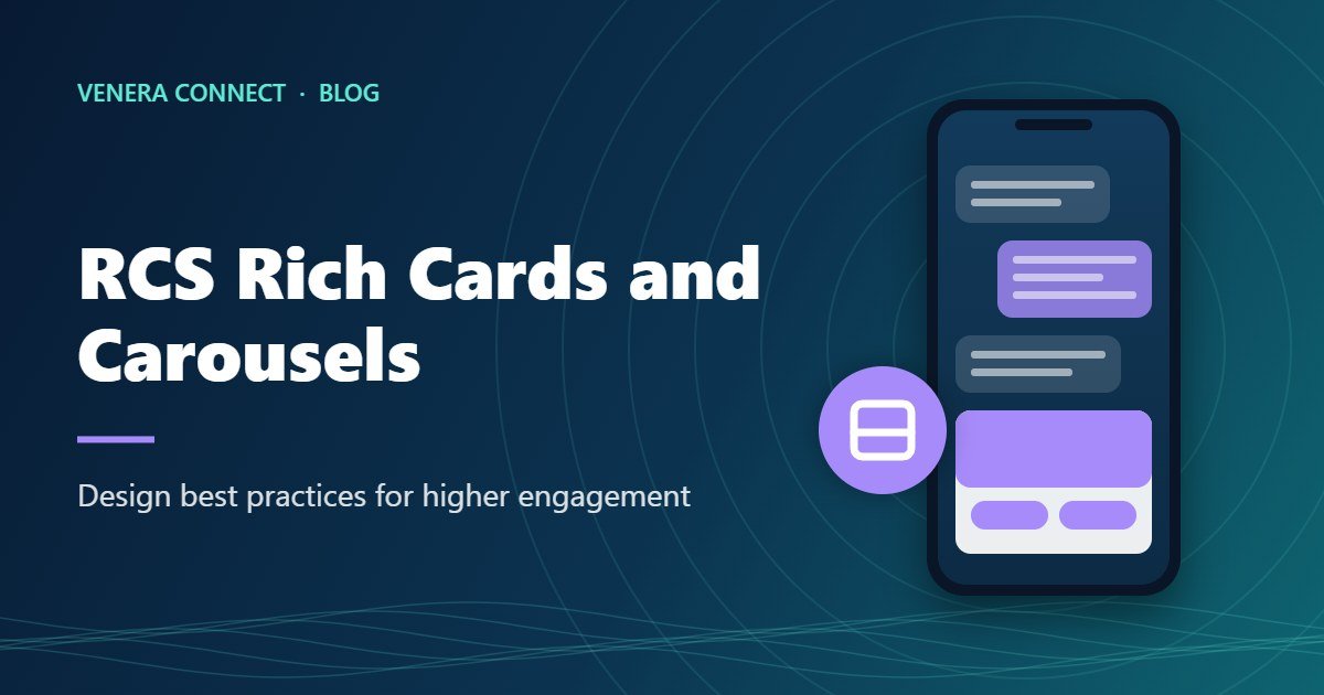
The biggest difference between RCS and plain text messaging is visual. Instead of a block of text and a link, customers see a branded card with an image, a headline, a short description and buttons they can tap. When there is more than one thing to show, a carousel lets them swipe through several cards. Done well, RCS rich cards feel like a mini app inside the messaging inbox. However, done poorly, they look cluttered and get ignored. This guide covers the design principles that drive engagement.
Anatomy of an RCS Rich Card
A rich card combines up to four elements. The media sits at the top, usually an image, GIF or short video. Below it is a title, typically a single short line. Then comes a description, which carries a sentence or two of supporting detail. Finally, suggested actions or replies appear as buttons under the card. Each element has a job, and a card works best when every element is doing its job clearly without competing for attention.
A carousel is simply a horizontal row of rich cards that customers swipe through. All cards in a carousel share the same width and height setting, so consistency in image dimensions and text length matters.
Principle 1: Start with a Single Purpose
Before opening a design tool, decide what the one action is that you want the customer to take. Buy a product, book a slot, view an offer, track an order, download a brochure. A card with one clear purpose outperforms a card that tries to do everything. If you have several products or options, use a carousel rather than cramming them into one card.
Principle 2: Let the Image Do the Heavy Lifting
The image is the first thing customers see, and it decides whether they read further. In general, good RCS images share a few traits. They show the product or benefit clearly, with a clean background and strong contrast. Also, they avoid heavy text inside the image, because small text becomes unreadable on phone screens and duplicates the title anyway. They are cropped for the card height you choose, with the key subject centred so it survives different device displays. And they are optimised for file size so they load quickly on slower connections.
Consider short videos or GIFs for products that benefit from motion, such as a car’s interior, a fashion item in movement or an app demo. Keep them brief and make sure the first frame works as a still image.
Principle 3: Write Tight, Benefit-Led Copy
The title should state the benefit or offer in a few words: “Festive kurtas from ₹799”, “Your flight to Goa is confirmed”, “Service due for your car”. The description adds one or two supporting details such as a deadline, a key feature or a reassurance like free delivery. However, resist the temptation to write paragraphs; long descriptions get truncated and push buttons out of view.
Personalisation lifts engagement further. Using the customer’s name, city, product interest or booking details makes the card feel relevant rather than generic.
Principle 4: Make Buttons Obvious and Useful
Buttons turn attention into action. Use clear verb-led labels like “Shop now”, “Book slot”, “Track order”, “Call store” or “Get directions”. Limit each card to two or three buttons so customers are not overwhelmed. Put the primary action first. Use native actions where they help: open a URL, dial a number, show a location on a map, add an event to the calendar or share a location.
Principle 5: Use Suggested Replies to Start a Conversation
Suggested replies are chips that appear below the message, like “Show more styles”, “Different size” or “Talk to an expert”. They invite customers into a conversation without typing. Plan what happens after each chip is tapped, whether that is another carousel, a chatbot response or a handoff to a live agent.
Principle 6: Order Carousel Cards Strategically
Most engagement happens on the first two or three cards. Put your best-selling product, strongest offer or most personalised recommendation first. Also, keep the number of cards reasonable; five to seven is usually enough. End with a “View all” card that links to the full collection or catalogue.
Principle 7: Stay On-Brand
Your RCS agent already displays your logo and brand colour. Keep card imagery, tone and typography consistent with your website and social channels so customers recognise you instantly. Consistency also reinforces trust, which matters in an era of impersonation scams.
RCS Rich Cards Examples by Industry
| Industry | Card or carousel | Buttons |
|---|---|---|
| Fashion retail | Carousel of new arrivals with price on each card | Shop now, More like this |
| Food delivery | Card with a combo offer image and time-limited deal | Order now, View menu |
| Travel | Booking confirmation card with destination image | View itinerary, Add to calendar, Get directions |
| Automotive | Video card of a new model | Book test drive, Find dealer |
| Education | Carousel of courses with duration and start date | Download brochure, Talk to counsellor |
| Healthcare | Appointment reminder card with doctor photo | Confirm, Reschedule, Get directions |
Testing and Optimising RCS Rich Cards
Above all, treat every campaign as an experiment. Test one variable at a time, such as image style, headline, button label or card order, and compare read and click rates across segments. Check rendering on a range of Android devices and iPhones, since display sizes and RCS client versions vary. Look at which buttons get tapped most and which cards in a carousel get the most engagement, then feed those insights into your next design.
Also plan the fallback experience. Meanwhile, customers who are not reachable on RCS should receive a clear SMS version with the core message and a link. For guidance on the full campaign process, read how to launch an RCS business messaging campaign.
Common RCS Rich Cards Design Mistakes
- Text-heavy images that are unreadable on phones
- Inconsistent image sizes in a carousel, causing awkward cropping
- Too many buttons or vague labels like “Click here”
- Long descriptions that push buttons out of view
- No plan for replies or taps, leading to dead ends
- Low-resolution or off-brand visuals
Accessibility and Inclusivity
Good design works for everyone. Choose image and text colour combinations with enough contrast for customers with low vision or those reading in bright sunlight. Avoid conveying important information through colour alone. Keep button labels descriptive so they make sense out of context. Where your audience prefers regional languages, create localised versions of your cards rather than relying on English alone; a festive carousel in Hindi, Tamil or Bengali can feel far more personal and often drives stronger engagement in those markets. Finally, remember that some customers have limited data plans, so keep media files light and ensure the core message is understandable even before images fully load.
Google’s RCS Business Messaging documentation lists the current size limits for cards and media.
Frequently Asked Questions
How many cards can an RCS carousel have?
Carousels support multiple cards, commonly up to around ten. In practice, five to seven well-chosen cards usually perform best.
Can I use video in RCS rich cards?
Yes. Rich cards can include videos and GIFs, which work well for products that benefit from motion.
Do rich cards look the same on every phone?
Rendering is broadly consistent, but screen sizes and messaging app versions cause minor differences. Always test on several devices.
Design Better RCS Experiences with Venera Connect
Venera Connect helps brands design, test and send rich cards and carousels, with analytics and automatic SMS fallback. Explore our RCS solution or talk to our team.